Sci-Fi Medical Bay


Making of Sci-Fi Medical Bay
During my time at AIE I produced a 3D environment based on old school sci-fi aesthetics, aimed to look like a medical bay. Alien, Blade Runner, 2001: A Space Odyssey and Star Wars were the main sources for inspiration for this ‘old school’ design language.


The majority of the assets populating the scene were created in Maya and textured in Substance Painter. The final images were rendered using Pixar’s Renderman, with the final touch ups being done in Photoshop. The scene was constructed based on a concept piece created by Toni Pykalaniemi. When I first saw the concept, I read the scene with a utopian, futuristic tone but noticed that the scene still contained CRT screens and a corded phone. It was these smaller elements that inspired the direction I eventually went with, dialling the 60’s-80’s feeling up to 11. To view all of the reference images which were used to create this series, click on this link.


What Went Wrong In The Project?
I think I may have had too large a scope on this project and really cut it close for getting everything done to a level I was happy with in the allotted time. My sleep certainly suffered more than anyone who manages their time well should have.
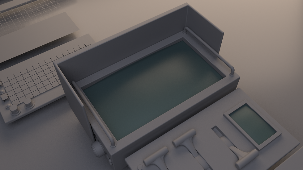
I think that the support beams crowd the composition of the scene too much. This crowding was intentionally done in order to achieve the sense of claustrophobia felt in many of the older sci-fi environments. However, I believe it was taken too far in the end and is overbearing in many of the frames. To try and remedy this, allowing the viewer to see the med pod arm and draping cable, I did not place a joining piece between the supports.


I believe I may have taken too much time getting the cables to sit in ways that I liked. From the perspective of the primary composition, the 18 hours I spent on them doesn't seem worth the trouble.
A lot of my reference shows shelves in a medical bay (for instance Firefly and Alien) however, I don't believe the purpose of these cupboards and shelves are clearly discernible. I think putting additional medical items on the shelf would help identify that the cupboards are for medical purposes but unfortunately due to time constraints, this was not possible.

The lighting in my environment could have used more development and should have been considered from an earlier stage in its creation. While I believe I achieved my final goal of strong and dramatic shadows and lights, it was to the detriment of the readability for some of the silhouettes in my scene. There are also strange reflections or shadows in some of the shots that could have been easily fixed but unfortunately, due to time constraints, I was not able to solve any of these issues.

The random light source that's obvious in this shot...

...was used to help separate the med pod from the background as well as to show additional background detail
The random light source that's obvious in this shot...
What Went Right In The Project?
I believe that my decision to add cables into the scene really tied the entire piece together and helped me to achieve my intended claustrophobic and imperfect sci-fi tone. I think that the medical pod worked well in the space and that it has a good mix of big, medium and small details. My teacher’s suggestion for my wall trim (inspired by Paul Pepera), while not exactly fitting in with my initial vision, helped to ground the scene even further in reality which I believe is a key goal of the design language I hoped to emulate. It also gave the eye rest from the generally darker, harsh, machined lines and silhouettes of the rest of the objects in the scene.


A common trope among my references was the use of glowing square buttons. Because of this, I knew from an early stage that I wanted to include them in my environment. To construct this asset, I created a 'modular rack' that I was able to snap the buttons in and out of with ease. By taking the extra time to model it in this way, I was able to repeat the button board throughout the scene but have each rack contain a unique configuration of the coloured buttons. To add further complexity and flexibility in the rack’s modular construction, I created switches with hinged guards which could be set to ‘on’, ‘off’ or have the cover removed entirely. Because of my unique approach and effective execution of this seemingly simple asset, I would say that it is my favourite in the scene.


What would I do differently?
If I could create this project again, I would scale down the scope of the scene by possibly removing 1 or 2 walls to create more of a ‘vertical slice’ than a full environment. Constructing the parts of the environment that weren’t in the original concept took a long time and contain some of the least refined assets. I would use the time I had gained by scaling down to create other more detailed assets like the modular button board. With this extra time, I would also like to have created a larger variety of screens as I believe their repetition is quite obvious throughout the project.

Final Thoughts?
I’m disappointed in myself for oversights like not having a stronger idea for lighting, which prevented the scene from being fully cohesive and readable. However, I’m quite happy with my final renders and am proud of many of the things I was able to achieve in the process of creating the environment.